Your cart is currently empty!
Color Packaging Boxes: A Strategic Marketing Tool, Not a Luxury
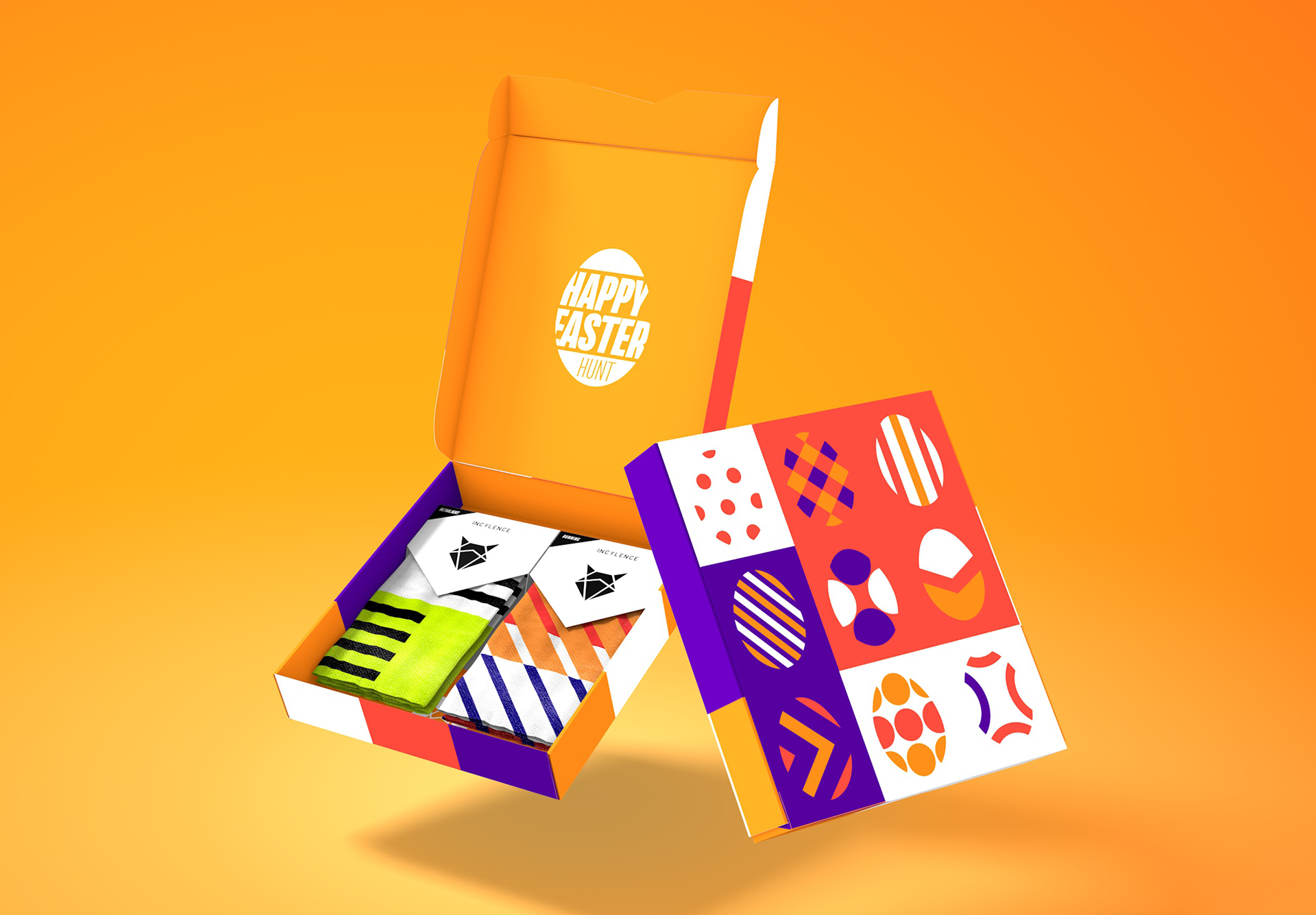
In the world of online stores—where customers can only see a product before touching it—a color packaging boxes are no longer a luxury choice. It’s a strategic decision. One that can either imprint your brand in the customer’s mind or leave it completely forgettable.
If you still think packaging is only meant to protect the product, let’s be clear: that mindset has expired. Today, attractive packaging design is the first physical touchpoint between your brand and the customer. The moment the box is opened, the game begins. You either win—or you lose.
Why Color Packaging Boxes Are a Real Marketing Tool
Marketing isn’t just Instagram ads and discount codes. Color packaging works quietly—but deeply. Colors create emotions: trust, excitement, luxury, or professional simplicity. When a customer opens a well-designed, thoughtfully colored box, they instinctively perceive the product as more valuable. That’s marketing without words.
In reality, a color packaging box is like a small billboard that goes straight into the customer’s home. It can’t be skipped. It can’t be filtered out.
Attractive Packaging Design: The Fine Line Between Professional and Overdone
This is where many brands fail. Attractive packaging design doesn’t mean covering the box with loud colors and chaotic graphics. Attraction comes from harmony—between color, material, typography, and brand identity.
Smart brands understand that sometimes a simple color box with a clean finish is far more impactful than a complex, overdesigned package. These are the designs that look elegant, feel organized, and communicate quality—without shouting.
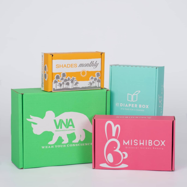
The Role of Color in Brand Recall
The human brain processes color faster than text. That’s why successful brands turn one or two specific colors into their visual signature. When those colors consistently appear on a color packaging box, the brand becomes embedded in the customer’s memory.
So the next time they see that same color combination—even before spotting the logo—they recognize your brand. This is the exact moment packaging transforms from a cost into a marketing asset.
The Unboxing Experience: Free but Powerful Marketing
Let’s be honest: unboxing isn’t just an Instagram trend—it’s a golden opportunity. If your box looks worth showing, customers will create content for you.
But there’s a condition: clean appearance, accurate color execution, and a design that looks good on camera. Boxes that open smoothly, have consistent surfaces, and feel “well thought out” are the ones that end up in stories and reels—without you spending a dollar on ads.
Smart Simplicity: The Choice of Mature Brands
Not every brand needs to shout. Some speak quietly—but with authority. Using color packaging boxes with a simple, functional structure is a mature decision, especially for brands that prioritize quality.
This type of packaging shows attention to detail, not visual noise. In practice, many professional online stores are moving toward boxes that combine color, minimal design, and structural strength—a combination that works for both safe shipping and strong brand perception.
Conclusion: If You’re Not Seen, You’re Not Sold
The market is crowded, and customer attention is limited. A color packaging box can be the small difference that separates your brand from the rest. When designed correctly, it’s not an expense—it’s a long-term marketing tool that works with every shipment.
Final word?
A great product without the right packaging is like the right message delivered in the wrong tone. It won’t be heard.
by
Leave a Reply